Settings
Basic settings
Seperator
Seperator is used to identify each tab, the default value is tab: .
TIP
You can modify it to ## , so you can directly select the content and use the command convert-selected-text-to-tabs to convert the content to a Tabs component without modifying the content.
Default tab title/content
The default title and content of the tab when creating a new tab.
When using the Paste tab command, if the clipboard content does not start with the separator, the title of the new tab is the default title
Action button
The action button at the end of the Nav, you can set it to:
- none: Hide the action button
- Add new tab: Add a new tab
- Edit tab: Edit the current tab
Ignore notice
Hide the notice related to Tabs component, such as the notice when deleting, pasting, or adding a new tab
Autorefresh markdown view
- When enabled, when you modify the Tabs related settings, close the settings panel will automatically refresh all opened markdown pages, the purpose is to refresh all Tabs components
- When disabled, when you modify the Tabs related settings, you need to manually re-render the Tabs component. There are many ways to do this, for example, move the cursor in and out, reopen the current tab page, etc.
A component's properties are determined at the time of rendering
For example, you have a Tabs component that has been rendered under the default top layout, then you modify the default layout in the settings to left, this layout will not take effect on the already rendered component, the new settings only take effect on the components rendered after the settings are modified.
This is the logic of obsidian for rendering code blocks, not a special logic written by the Tabs plugin.
Drag and drop
Whether to enable the drag and drop function
Editor settings
Double click to edit
When enabled, you can quickly edit the current tab by double-clicking the content
Show toolbar
When enabled, a toolbar will be provided at the top of the Tabs editor for editing
Tab size
The number of spaces to indent when pressing Tab in the Tabs editor, the default is 4
Auto save interval
Tabs editor will automatically save the content when you modify the content, you can set the interval of auto-saving, the unit is milliseconds. The default is 5000, which means that when you modify the content, after 5s, the editor will automatically save the content to the markdown file.
Appearance settings
The Appearance settings provide a sample Tabs component, you can view the effect through the last tab: Lorem ipsum while modifying the settings
Tabs
Tabs border
Tabs component border
- None: Hide border
- Hover: Show border when hovering
- Always: Always show border
Tabs border color
Tabs component border color
Hide tabs code block edit block button
Hide the edit block button on the top right of the code block when hovering
Tabs nav
Nav default position
The default position of the Nav, optional values are Top, Left, Bottom, Right, can be overridden by customization.
Nav line clamp
The arrangement of titles in the Nav when there are too many titles (only effective for top and bottom layouts)
- One line: All titles are placed on one line, and the overflow part can be scrolled horizontally after pressing shift
- Multiple lines: Overflowing titles are placed on a new line
Limit tab title width
Limit the width of a single tab's title
The Tabs of obsidian has a maximum width, if you want to keep the same style as obsidian, you can enable this option. After enabling, if the title is too long, it will be omitted with ...
Tabs contents
Contents padding
The padding of the content, that is, the distance between the content and the surrounding area (the distance between the red and orange lines in the figure)
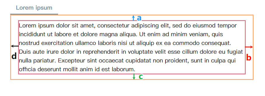
The value rules are consistent with the padding in CSS, you can input 1-4 values, and different numbers of input values represent setting different positions of the padding, the values are separated by spaces
| Number | Position | Example | Explanation |
|---|---|---|---|
| 1 | a b c d | 10px | a = b = c = d = 10px |
| 2 | a c, b d | 10px 5px | a = c = 10px, b = d = 5px |
| 3 | a, b d, c | 5px 10px 20px | a = 5px, b = d = 10px, c = 20px |
| 4 | a b c d | 5px 6px 7px 8px | a = 5px, b = 6px, c = 7px, d = 8px |
value unit is consistent with css, you can use px, em, rem
- px: pixel
- em: width of a character, for example,
indent: 2emmeans indent two characters - rem: relative unit, the multiple of the child element's pixel value
Contents max height
There will be a scroll bar when the content of the Tabs is too long, you can set the maximum length of the content here, the default value is 60vh, which means when the length exceeds 60% of the page height, the height will no longer increase, and a scroll bar will appear (vh is the abbreviation of Viewport Height). You can also use other units such as pixels.
If you want to display all content, you can set it to none